Breathing life into the LiberEat brand as the business takes focus on developing technology that makes food safer and easier for the growing population of people living with dietary requirements.
LiberEat is a technology business with a mission for good. Their ambition is to make food easier and safer for the growing population of people living with dietary requirements, such as food intolerances and allergies. Over the lifetime of the business, LiberEat has developed from an app that showcases bespoke menu items, recipes and food products to suit the users unique dietary requirements, to a highly scalable technology business that aims to eliminate human error in food labelling, menu creation and supplier data.
Operating since 2016 and passing through many phases of brand designs, LiberEat decided to settle down and get serious about creating a professional, unique and consistent brand in 2020.
Throughout the many different phases of the LiberEat brand logo, one mark remained the same – the LiberLeaf. Within the team it had become a marker of safety and a signifier of assurance. Aligning with the dreams of one day becoming an industry-standard for marking foods – think The Vegan Society’s Vegan Trademark – it was important to keep the LiberLeaf part of the brand revamp.
However, something was off. Something wasn’t quite clicking and the LiberLeaf didn’t feel complete. The harsh points and thin lines went against the grain of the friendly, approachable brand voice.
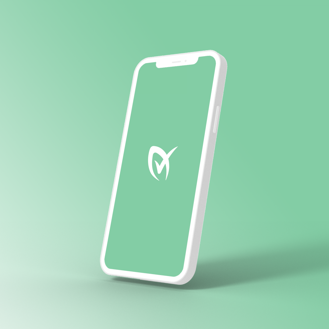
In order to develop a logo as unique as the technology, we couldn’t just use something out of the dusty type drawer. From something that started as an idle doodle during a lazy Sunday watching the telly, quickly blossomed into pages of sketches and developments and matured into a bespoke geometric typeface.
The soft curves and full circles throughout the typeface evoke a feeling of hopefulness and represent that friendly, approachable nature.
Green can be a difficult colour to say the least, but this particular shade was fondly called ‘the devil’s green’ by the founder, Barry. Beyond being a difficult shade to work with, with low contrast (not ideal for the app UI), the green just didn’t sit well with the team. We felt that it was off. Was it too much yellow? Was it too light? Did it feel too washed out?
The colour had been part of the brand since the beginning, it didn’t feel right to just cast it into the cold in favour of another colour. It took a little digging to find the right shade, adding in splashes of blue, deepening the hue and creating balance between green and teal to find the right balance. The deeper hue felt authoritative, while the complimentary spearmint brought in a modern twist.