
A mobile application allowing individuals with allergies and intolerances to find foods suitable for themselves, friends and family members. LiberEat highlights the allergen content of food in restaurants, supermarkets and recipes, making it easier to make safe decisions.
LiberEat launched their initial app with the intention of taking allergen data directly from supermarkets and restaurants, providing a safer experience for people with food allergies. The existing allergy apps on the market would often used screen-scraped data, meaning it wouldn’t always be accurate or updated frequently enough to be safe and useful. LiberEat became the first mobile application to use data directly from the food providers.
After a successful launch, the start-up realised the need for a fresh look and feel to the app to move forward in the investment and business growth phase. Through a Santander internship, I joined the team to research the user experience and improve the existing app. Initially, the team planned for a simple redesign to give it a ‘cleaner’ look but after my investigation and interviews with users, I advocated for a much deeper, more meaningful change to the app.
Over the course of three months, I worked closely with the Lead Architect to develop the LiberEat app into something that would be future proof and encompass the project goals.
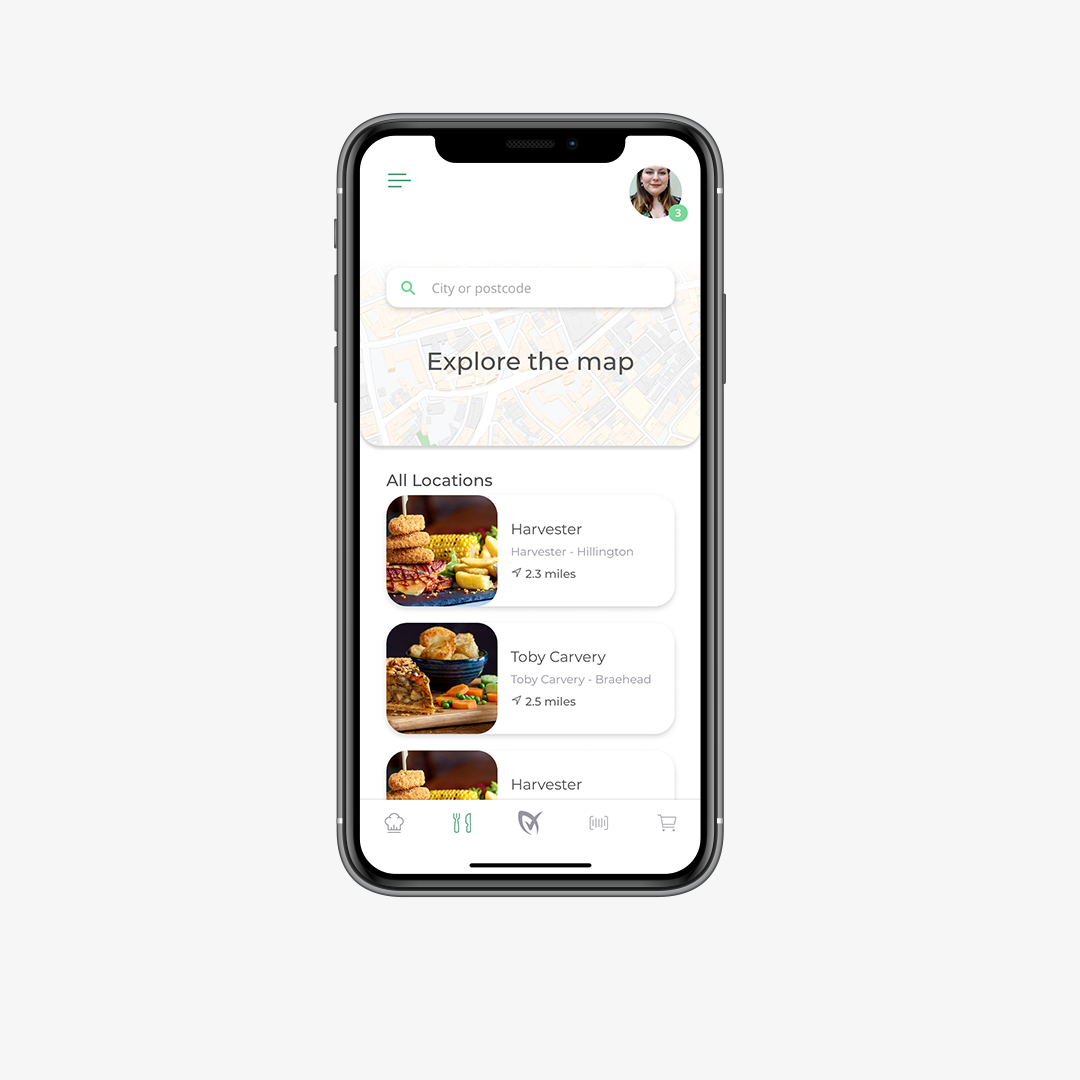
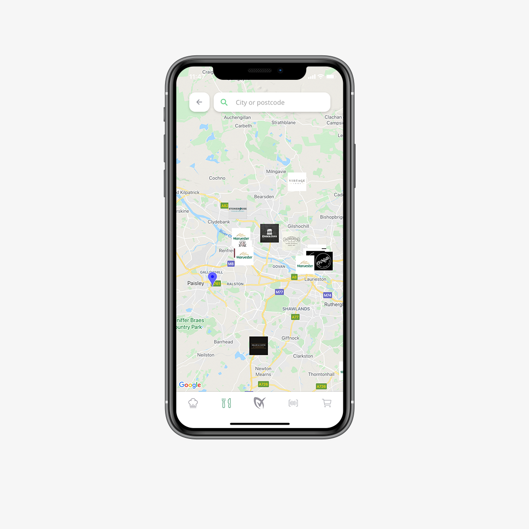
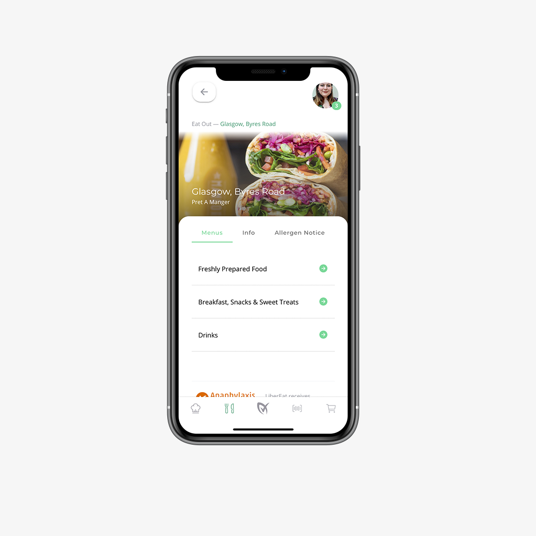
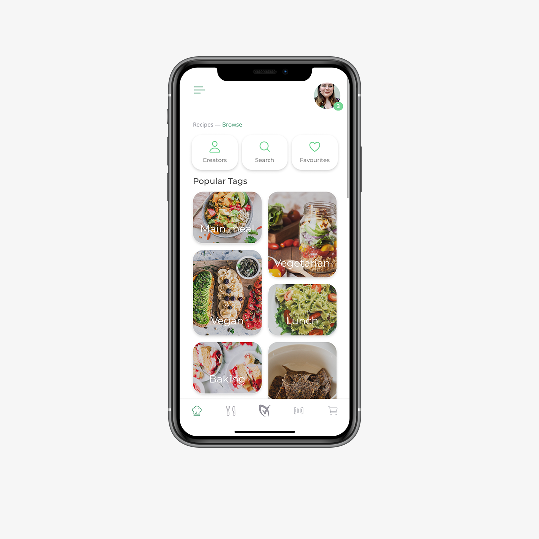
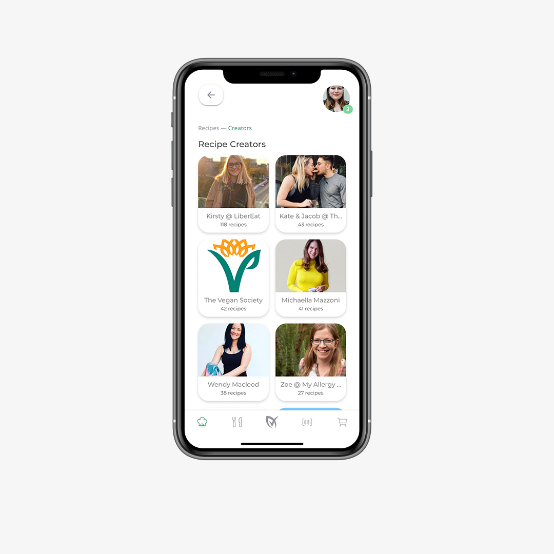
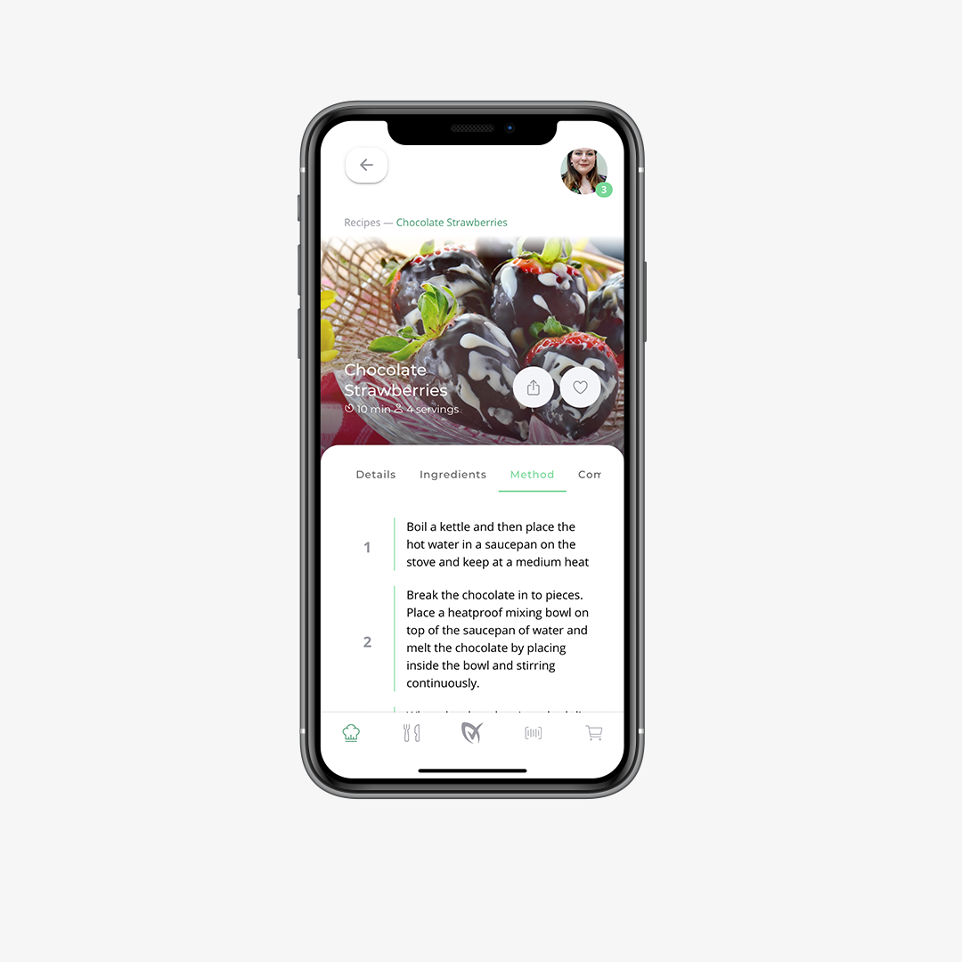
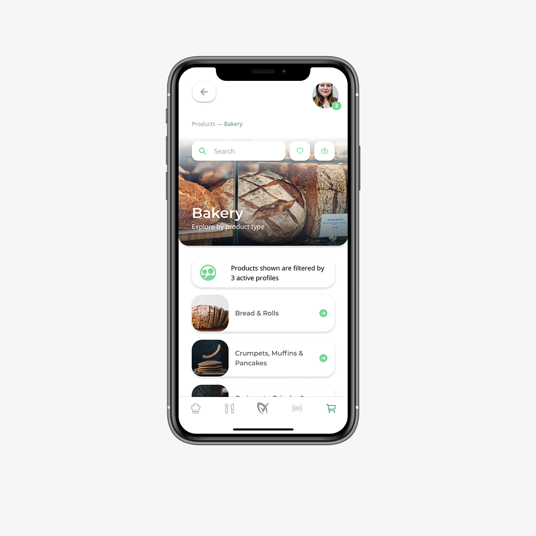
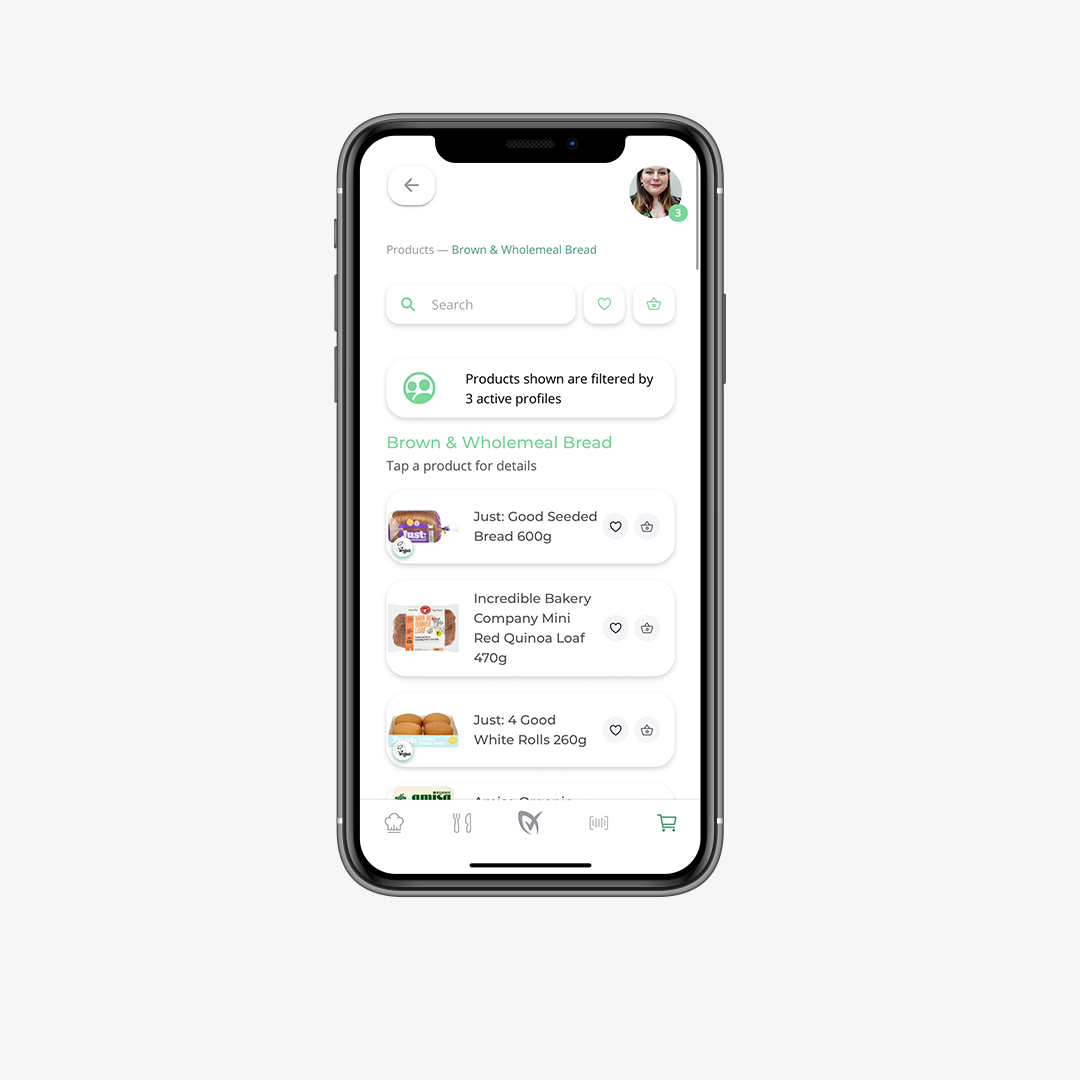
I worked in the Agile methodology to balance time and resources between the four main features of the app: barcode scanner, product discovery, recipe library and restaurant exploration. Harnessing this methodology allowed me to look at the app holistically, as well as diving into details about the specific features of the app.
Often, I would look at each feature in a process of UX audit, competitor analysis, user interviews and team workshopping to formulate the best course of action. Once the key goals were outlined, I’d move into the wireframing stage before ultimately developing a high-fidelity prototype in Adobe XD to use as an Alpha version of the app to use for user testing and comparison to the previous app.
Competitor analysis, mood-boarding, user interviews (new and early adopters)
Internal analysis of previous mobile app, testing theories and ideas with users
Working closely with the developer and other team members to craft the perfect look and feel
Creation of working prototypes in Adobe XD ready for user testing and investor presentations
Closed user testing of prototype with team members friends, family and early adopters of the app
Staged launch due to the development of large features which were a big change from the previous version
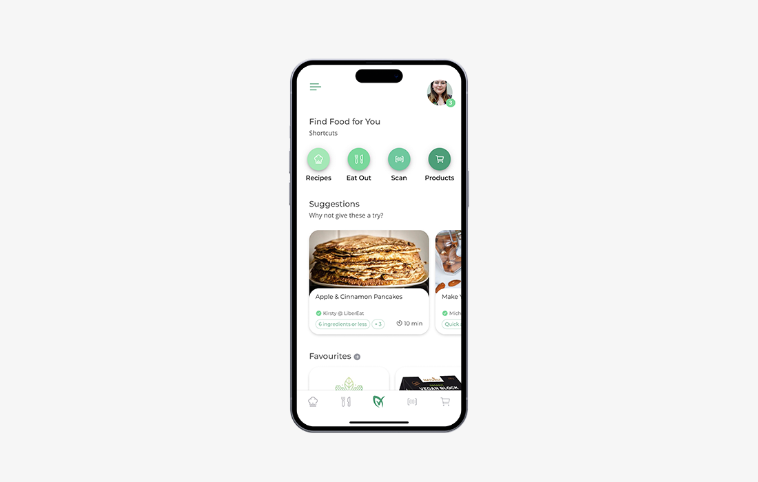
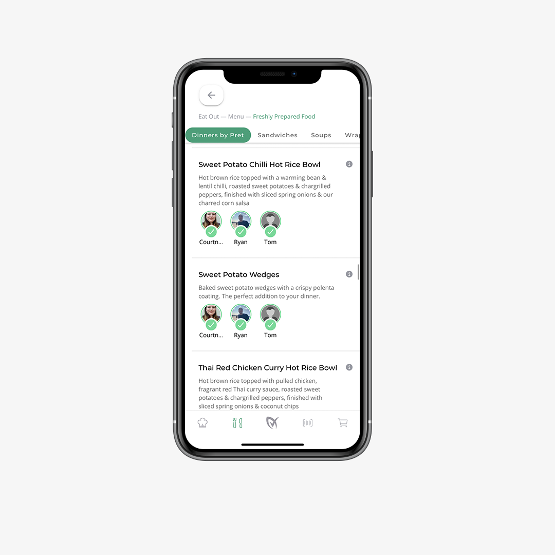
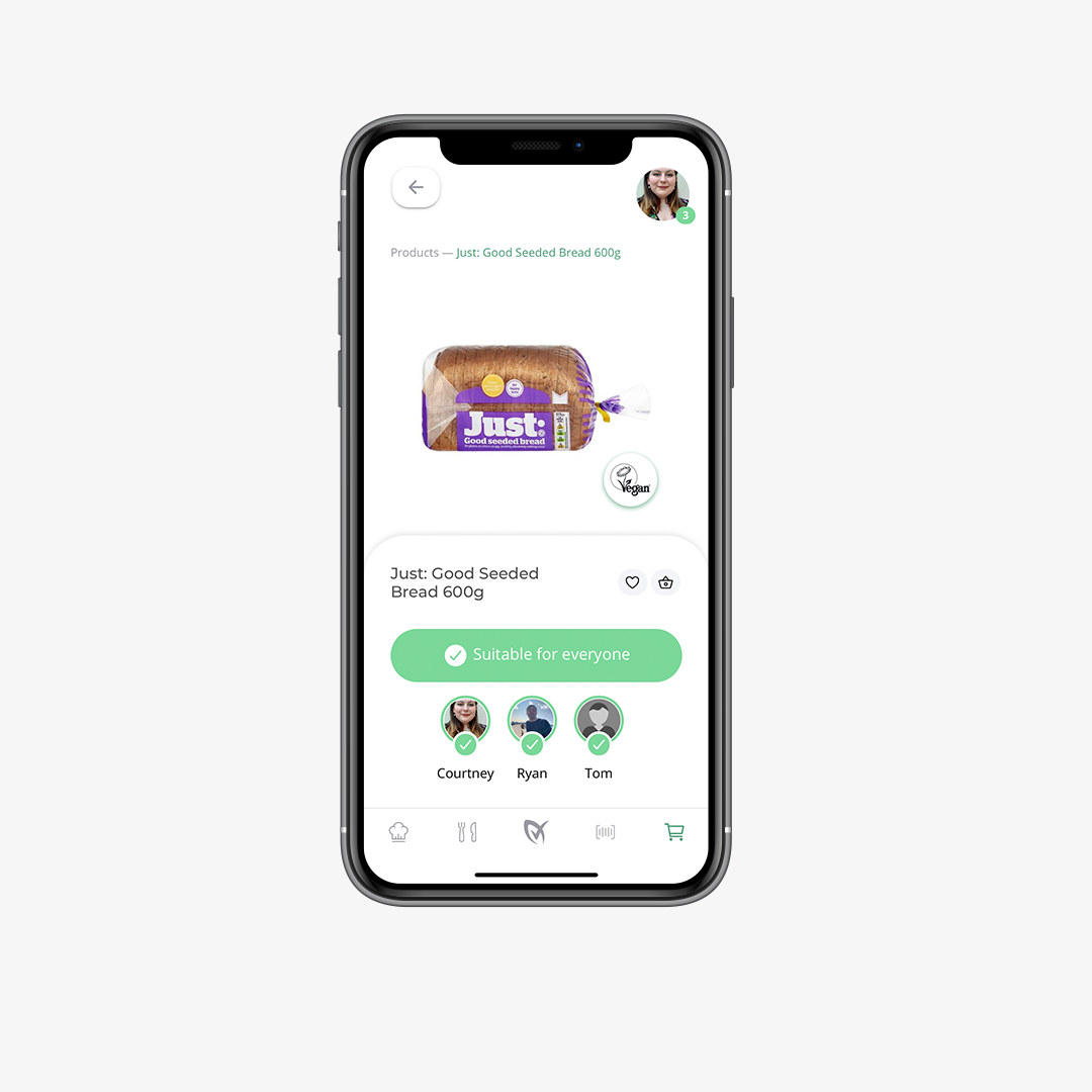
A key USP of the LiberEat app was the ability to manage multiple ‘profiles’ with one account, making it easier for families to manage multiple dietary requirements simultaneously. However, research showed that in the initial app design, only around 3% of users utilised this feature.
After exploring the possibilities and listening to some early adopters of the app, we realised the way multiple profiles were handled wasn’t very user-friendly. These interviews revealed a couple of key objectives that needed to be included in the new app to make this feature more prominent:
Don’t overcrowd & let me control it
To answer objectives 2 and 3, I tucked the profiles away into a handy button shortcut to a profile management screen. This allowed the user to see how many profiles were active at that time, and a dropdown on tap allowed them to quickly toggle profiles on or off, no matter where they were in the app.
To add profiles, the dropdown also included a button to make it clear that more than one profile could be added. The design of this shortcut button drew on the principles of familiar apps, such as social media platforms, by using the profile picture of the user to represent profiles. Using this prevented the learning curve of the feature to be shorter and more instinctive. Test interviews showed that the users quickly picked up on this feature without guidance or much guesswork.
Make it obvious
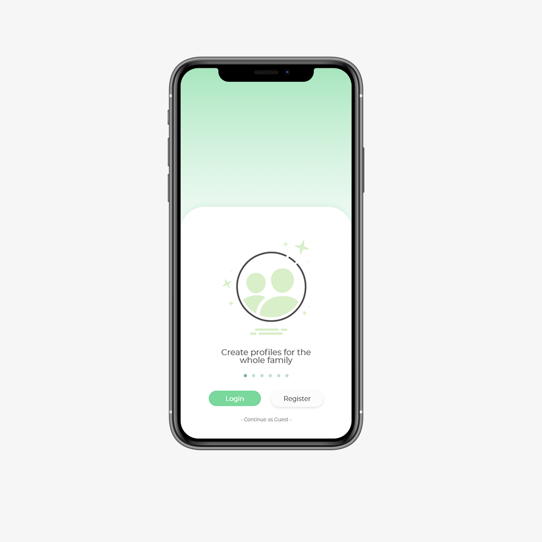
To solve problem number 1, I proposed we created a wizard helper tool that would appear on the first load of the app, pointing out key features. However, due to budget and time constraints, we were unable to fulfil this idea and instead created a slider welcome screen before users logged in to showcase a few important features.To add profiles, the dropdown also included a button to make it clear that more than one profile could be added. The design of this shortcut button drew on the principles of familiar apps, such as social media platforms, by using the profile picture of the user to represent profiles. Using this prevented the learning curve of the feature to be shorter and more instinctive. Test interviews showed that the users quickly picked up on this feature without guidance or much guesswork.