Create an end-to-end desktop application to replace laborious and clunky Excel processes used within a successful coach matching company.
A desktop application with automated emails and Outlook integration to replace an onerous administrative process for creating and managing contracts. After a rapid expansion in the coaching team, Blend quickly found that their existing system was not capable to keep up with the large business changes.
An Introduction to Blend Ltd.
Blend Ltd. provide coaching services to a range of organisations, specialising in the public sector – specifically the NHS. Their proprietary matching process puts coaches with people based on their goals, experience and any personal needs.
They are unique in their matching, including more than just level of experience, looking deeper to connect on more personal matters such as helping with returning to work, menopause and mental health.
The Project
Blend approached us with the intention of creating a piece of software to automate some emails and manage their Excel sheets more efficiently. After an initial consultation call, we realised that the changes need to be much deeper than some fancier spreadsheets, and instead we worked closely together to refine their intake and contract management process to prepare for further expansion.
The outcome
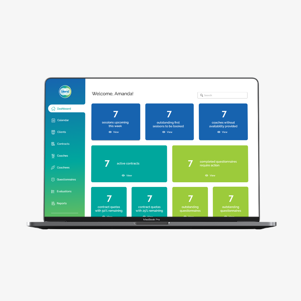
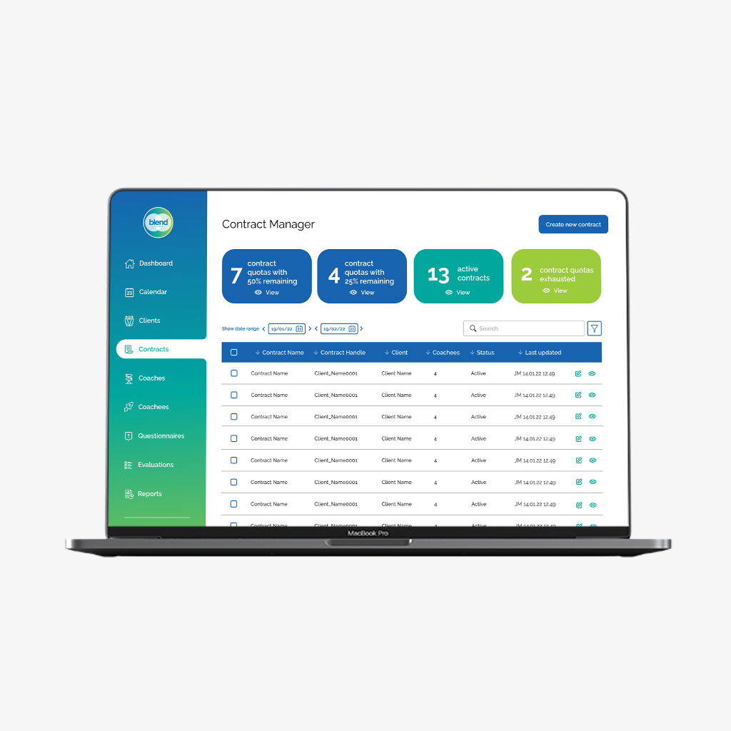
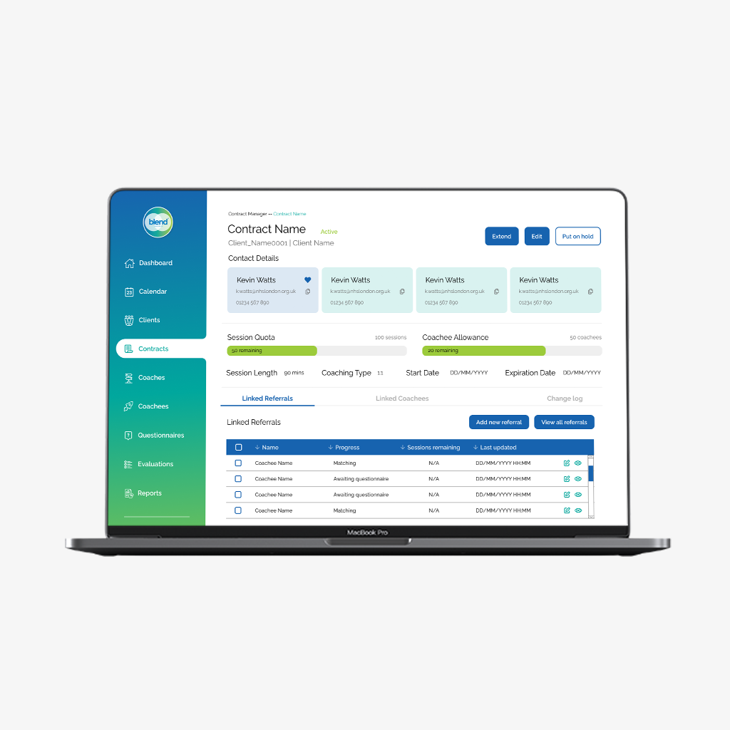
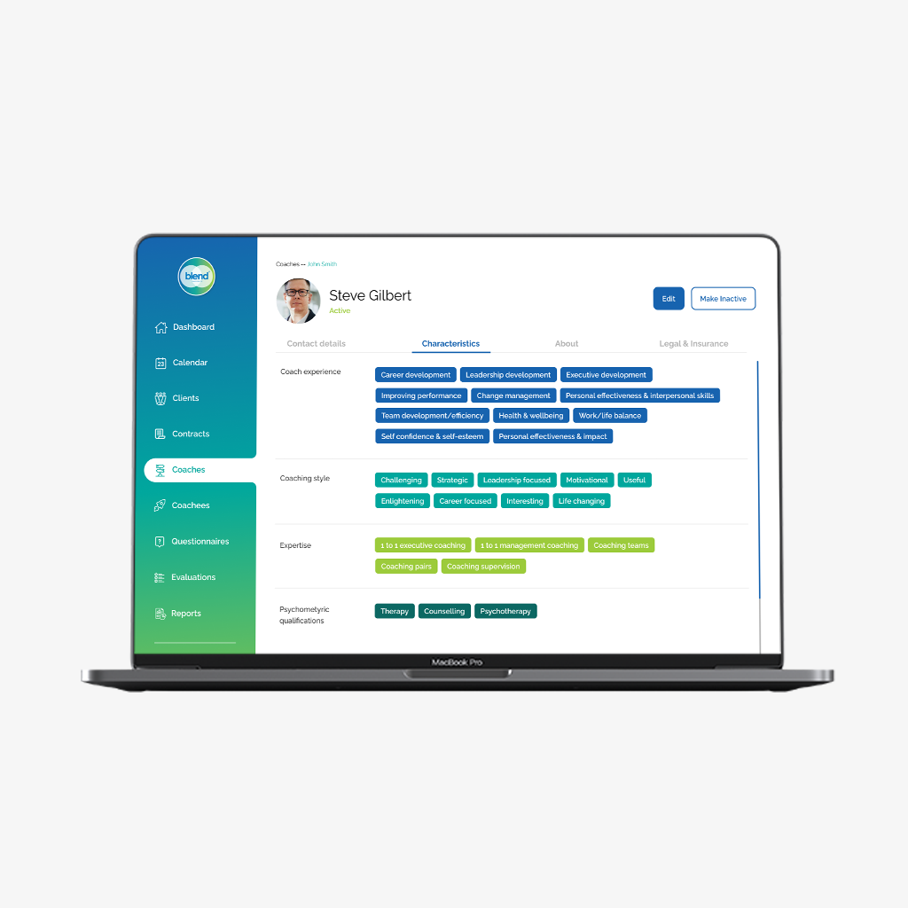
A complex admin and management resource software to ease the pressure of the Blend team – that aided with coachee matching, coach and client management. Our solution compromised of two elements – a system for the Blend office, and a client facing questionnaire/evaluation survey that fed into the system’s intricate coach matching criteria.
In the process of expansion, their business processes had been left frozen in the same state, so part of our solution required working with them to develop user flows at a granular level. We helped each other better understand the ideal business processes and in turn this allowed us to develop software that would be a natural fit whilst also steering them towards success.
We built software with strong foundations, with a base that will allow the software to continue to grow and develop with the business as it continues to level up. It’s the groundwork and discovery we made throughout the design process where the true value came from.
Previous
Next
My process
1
Discovery
Working closely with the Blend team to understand the current processes and explore areas for improvement.
2
Process flow refinement
Exploring the current processes to explore how bespoke software or automation could be used efficiently in the system. Crafting user flows in an iterative process of feedback and refinement.
3
UX wireframes
Designing various stages of wireframes, beginning with low fidelity sketches for the internal team and working up quickly (due to budget and time constraints) to high fidelity wireframes for prototyping and testing.
4
Prototyping
Creating working Figma prototype for testing. Batching different features into their own prototypes to illustrate the user flow of the process clearly.
5
User testing
Running ‘show me, tell me’ workshops with the Blend team to test the prototyped wireframes to ensure the designs reflected the day-to-day experience for the team. However, due to the nature of the application, the most accurate user testing came in the beta stages of testing.
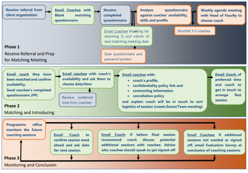
Process flow refinement
The original process flow, created by the Blend team before hiring us.
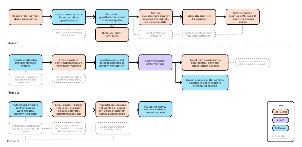
Our pitched user flow, this was used in the early stages of the project to hook Blend in. These were later developed further into specific process flows.
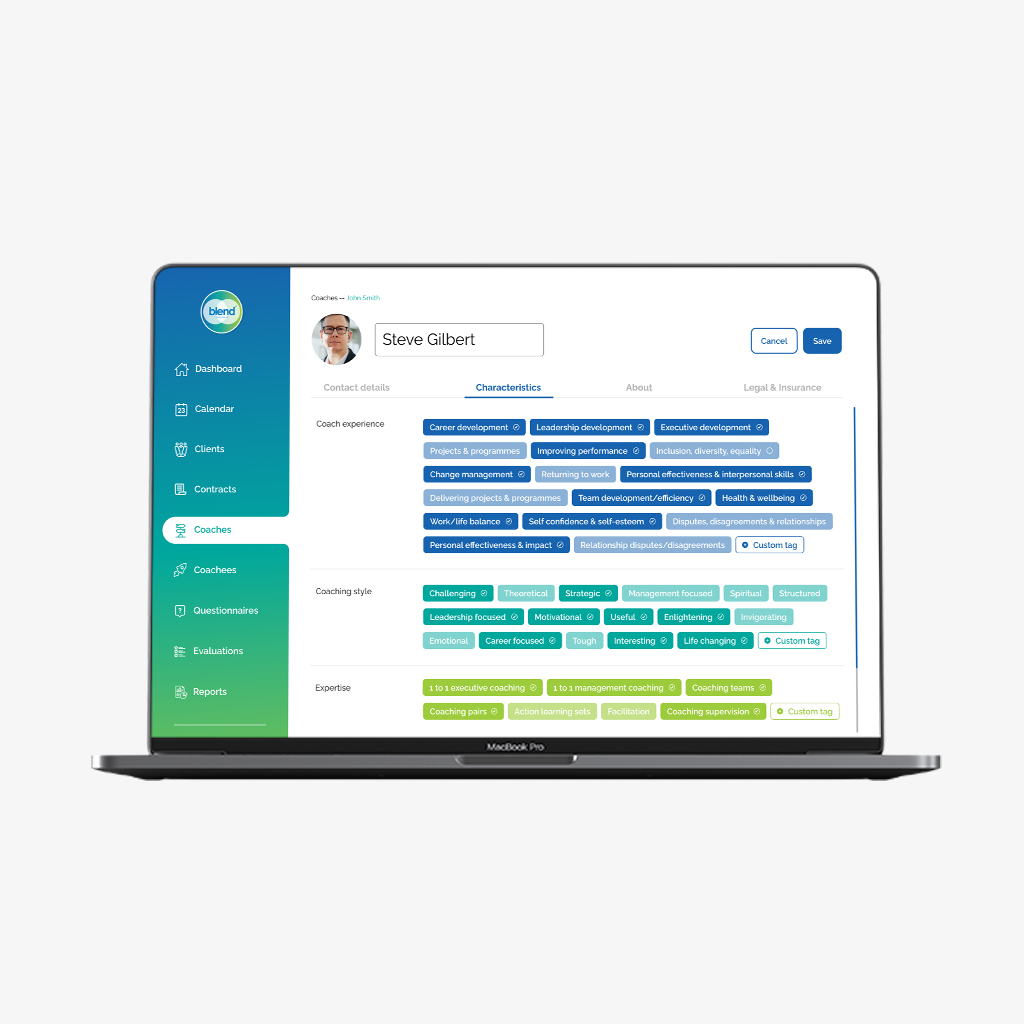
Wireframe & prototyping
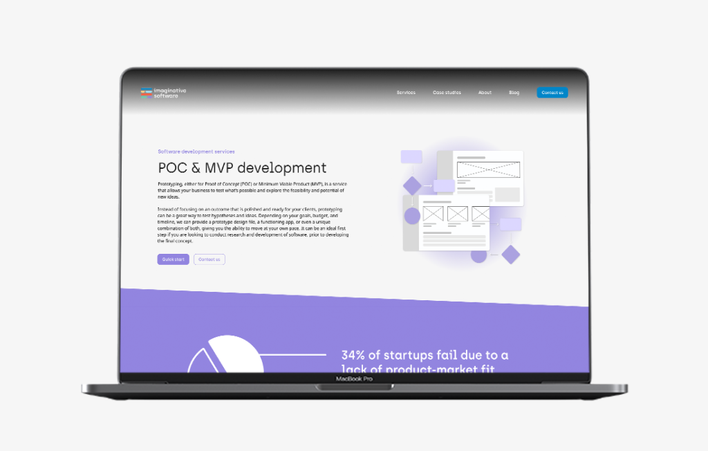
The previous services page was an SEO nightmare. All services were placed on one page, but we wanted to talk in a lot of detail. In addition, there were no CTAs for website visitors to convert to clients.
The new structure planned to divide all services into their own pages, in order to provide more detail and also optimise the search engine experience too. More visuals and CTAs break up the text, making it more digestible and page anchors would help users easily navigate this information heavy page.