El Secreto, authentic pizzeria originating in Italy, pour their love into food that hums with creativity, devotion and passion. The creation of this brand marked the start of a new era, but needed to maintain the soul of it’s humble beginnings.
From the start, Emiliano & Sabrina made it clear that the launch of their restaurant came from a place of deep love and respect for the craft of pizza-making.
To Emiliano, making pizza was the same as creating a Picasso – it took time, expertise and a dash of devotion. To Sabrina the experience was an integral part – she wanted not to just create a pizza restaurant, but to create an experience that made you feel like you’d just stepped into Mama’s kitchen. You know that as soon as you take a perch, you’re in warm, caring hands.
Nestled away in San Isidro, El Secreto looks over the breathtaking, mountainous terrain of Tenerife. From the images of the restaurant location, I was intensely inspired to begin drawing up colour palettes that suited the wild landscape. With each mood-board, I wanted to represent emotions that transcend our language barrier. One of my favourite challenges from this brief was to explore how I could use visual storytelling & brief wording to sell my ideas. However, with the same passion they had for their food, I had for design – it was easy to use photography and illustration to visually demonstrate the style we were aiming to achieve.
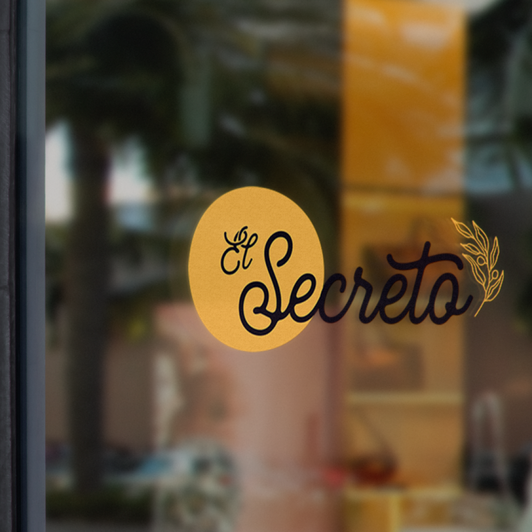
The winning palette from this round was a beautiful collection of colours inspired by ‘summertime at 5pm’ – think that warm, rich low afternoon sunlight and the taste of ripe tomatoes with the crunch of toasted ciabatta. It was important to hold onto the Italian heritage, without getting lost in clichés and stereotypes – which is why ‘Naples yellow’ became an integral part of the brand. The orange-hued yellow pulls you to the sunshine-covered buildings of Venice. Complimented by a bold, modern orange with heavy red balances – the colour palette falls far from the drab, overused Italian inspired palettes. While this intense complimentary colour may scare some – Emiliano & Sabrina felt that it truly represented their flair and the boldness in their menu.
“It’s a rare sight, but Courtney has created a brand that really speaks to the character of Emiliano & Sabrina. They naturally know how to work the brand without outside help – which shows the value in what she has created”
Sofie, Project Manager